
Responsive Design (RE) in WordPress Website Development: Best Practices
Introduction: Crafting Seamless User Experiences with Responsive Design
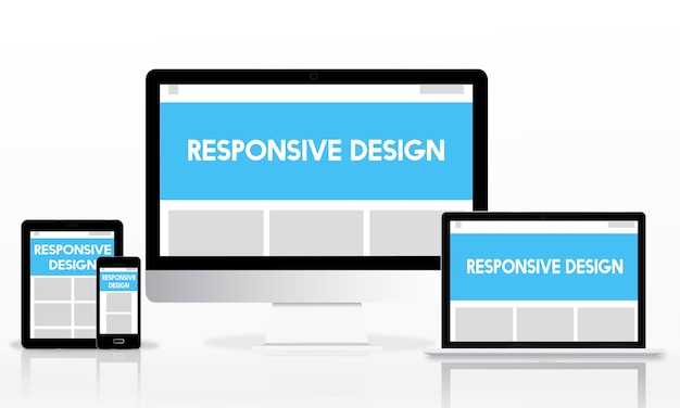
Responsive design is a cornerstone of modern WordPress website development, ensuring that websites adapt and provide an optimal viewing experience across a variety of devices. This guide delves into the best practices for implementing responsive design in WordPress, focusing on creating websites that are not only visually appealing but also accessible and functional on devices of all sizes.
Understanding Responsive Design in WordPress
Definition:
- It is an approach to web design that ensures a website responds dynamically to the user’s device, adjusting layout and content to provide an optimal viewing experience.
The Significance of Responsive Design
1. Cross-Device Compatibility:
- It ensures websites function seamlessly on desktops, tablets, and smartphones.
- Users can access content without compromise, regardless of the device they are using.
2. SEO Benefits:
- Google prioritizes mobile-friendly websites in search results.
- RE contributes to improved search engine rankings and visibility.
3. Enhanced User Experience:
- A responsive website provides a consistent and enjoyable user experience.
- Users can navigate and engage with content effortlessly, leading to increased satisfaction.
Best Practices for Implementing Responsive Design in WordPress
1. Mobile-First Approach:
- Design with mobile devices in mind first, then progressively enhance for larger screens.
- Prioritize mobile users to ensure a smooth experience on smaller screens.
2. Flexible Grids and Layouts:
- Use relative units like percentages instead of fixed units like pixels for layout elements.
- Implement a flexible grid system that adapts to different screen sizes.
3. Media Queries for Device Adaptation:
- Employ CSS media queries to apply styles based on the characteristics of the device.
- Tailor typography, images, and layouts to suit various screen dimensions.
4. Flexible Images:
- Use responsive images that scale proportionally to the container.
- Leverage the
max-widthproperty to prevent images from overflowing their containers.
Testing and Optimization for Responsive Design
1. Cross-Browser and Device Testing:
- Test your website on various browsers and devices to ensure consistent performance.
- Identify and address any issues related to specific browsers or devices.
2. Performance Optimization:
- Optimize images and other media files for faster loading times.
- Implement lazy loading to prioritize the loading of visible content on the user’s screen.
3. User Testing:
- Conduct usability testing with real users on different devices.
- Gather feedback to identify areas for improvement in the RE.
Case Study: Transforming Accessibility with Responsive Design
Client Challenge:
- A business website struggling with a high bounce rate on mobile devices.
Responsive Design Solution:
- Implemented a mobile-first RE approach.
- Improved navigation, optimized images, and streamlined content for a more engaging mobile experience.
Outcome:
- Witnessed a significant reduction in bounce rate on mobile devices.
- Increased user engagement and improved overall website performance.
Future Trends in Responsive Design for WordPress
1. Inclusive Design for Diverse Users:
- Anticipate a focus on designing for users with diverse abilities and needs.
- Inclusive design principles will drive the creation of websites accessible to a broader audience.
2. Advanced Animation and Interactivity:
- Expect the integration of advanced animations and interactive elements in RE.
- Subtle animations can enhance user engagement and create a more immersive experience.
Conclusion: Shaping the Future of WordPress Responsive Design
As we explore the best practices, case studies, and future trends in responsive design for WordPress, it’s clear that the landscape is evolving toward more inclusive, user-centric experiences. By embracing a mobile-first approach, implementing flexible design elements, and staying attuned to emerging trends, WordPress developers can ensure their websites deliver exceptional experiences across the diverse array of devices used by today’s audiences.
Advanced Strategies, Real-World Success Stories, and Expert Insights in WordPress Responsive Design
Advanced Strategy: Dynamic Content Loading
Implementation Approach:
- Utilize techniques like AJAX to load content dynamically based on the user’s device and interactions.
- Enhance the user experience by delivering content without requiring full page reloads.
Why It Matters:
Dynamic content loading contributes to faster page speeds and a smoother user experience, particularly on mobile devices with limited bandwidth.
Advanced Strategy: Progressive Web App (PWA) Integration
Integration Steps:
- Explore turning your WordPress site into a Progressive Web App.
- PWAs provide an app-like experience on mobile devices, including offline functionality.
Why It Matters:
PWAs offer enhanced performance, faster load times, and the ability to engage users even when they’re offline, significantly improving the mobile user experience.
Real-World Success Story: Elevating Mobile Engagement for a News Website
Client Background:
- A news website experiencing a decline in mobile user engagement.
Responsive Design Solution:
- Revamped the website with a mobile-first RE.
- Implemented dynamic content loading for quick article access.
Outcome:
- Marked improvement in mobile user engagement.
- Users reported a more seamless and enjoyable experience when accessing news on their mobile devices.
Expert Insights: The Future of Responsive Design in WordPress
Expert Prediction 1: Integration of Augmented Reality (AR)
Insight:
- Anticipate responsive designs incorporating AR elements.
- AR can enhance user interactions by overlaying digital information onto the real-world environment, creating immersive experiences.
Expert Prediction 2: Enhanced Personalization for Diverse Devices
Insight:
- It will evolve to offer more personalized experiences across diverse devices.
- Tailoring content and interactions based on specific device capabilities and user preferences will become more sophisticated.
Conclusion: Pioneering the Next Era of WordPress Responsive Design
As we navigate through advanced strategies, real-world success stories, and expert insights in WordPress responsive design, the future holds exciting possibilities. From dynamic content loading and PWA integration to the potential incorporation of augmented reality, responsive design continues to evolve, ensuring websites are not only visually appealing but also adaptive to the diverse needs and preferences of users across a myriad of devices.
Cutting-Edge Strategies, Case Studies, and Industry Predictions in WordPress Responsive Design
Cutting-Edge Strategy: Voice User Interface (VUI) Optimization
Implementation Approach:
- Optimize responsive design for voice-controlled devices and interfaces.
- Ensure that your website is accessible and functional for users interacting through voice commands.
Why It Matters:
The rise of voice-activated devices necessitates a focus on designing websites that cater to users engaging with content through spoken commands, contributing to a more inclusive user experience.
Cutting-Edge Strategy: AI-Driven Responsive Elements
Implementation Steps:
- Leverage AI algorithms to analyze user behavior and dynamically adjust responsive elements.
- Tailor layouts, content recommendations, and interactions based on AI-driven insights.
Why It Matters:
AI-driven responsiveness allows websites to adapt in real-time to user preferences, creating a more personalized and engaging experience.
Case Study: Revolutionizing User Accessibility with Responsive Voice Interface
Client Challenge:
- A website catering to users with varying abilities sought to enhance accessibility.
Responsive Design Solution:
- Implemented a voice user interface (VUI) optimized for screen readers and voice-controlled devices.
- Ensured that content, navigation, and interactions were seamlessly accessible through spoken commands.
Outcome:
- Received positive feedback from users with visual impairments and those using voice-controlled devices.
- The website’s commitment to inclusivity resulted in increased user satisfaction and engagement.
Industry Predictions: Navigating the Future Landscape of Responsive Design
Prediction 1: Wearable-Focused Responsive Design
Insight:
- With the proliferation of wearables, expect responsive designs tailored specifically for smartwatches, fitness trackers, and other wearable devices.
- These designs will prioritize concise and glanceable information for smaller screens.
Prediction 2: Context-Aware Responsive Elements
Insight:
- The future will see responsive design elements that adapt based on the user’s context.
- Factors such as location, device orientation, and user activity will influence how content is presented.
Conclusion: Shaping the Future of WordPress Responsive Design
In this exploration of cutting-edge strategies, impactful case studies, and industry predictions in WordPress responsive design, the horizon is filled with innovation. From voice user interface optimization and AI-driven responsiveness to the emergence of wearable-focused designs and context-aware elements, the future promises a dynamic and adaptive landscape for WordPress developers. As the digital ecosystem evolves, embracing these advancements in responsive design will be essential to crafting websites that cater to the diverse needs and preferences of users across an ever-expanding array of devices.