Responsive web design is no longer a trend. It’s a necessity. Google has even announced that it will be using mobile-friendliness as a ranking factor in its search engine.
This means that if you want your website to rank well in search results, you need to make sure it’s responsive.
In this blog post, we’ll discuss the best practices for responsive design in 2024. We’ll cover everything from creating a mobile-first design to using responsive images and fonts.
By the end of this post, you’ll have a solid understanding of responsive design and how to implement it on your own website.
So let’s get started!
Responsive web design
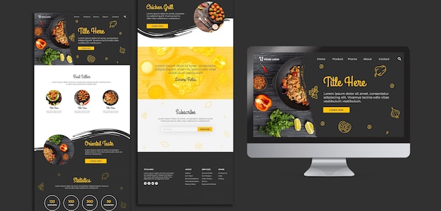
Responsive web design is a web design approach that makes websites render well on devices of all screen sizes, from desktop computers to mobile phones. This is done by using flexible layouts and fluid images that adjust to the size of the screen being used. Responsive web design is important because it ensures that users have a consistent experience regardless of the device they are using.
There are a number of benefits to using responsive web design. First, it makes websites more accessible to users who are using a variety of devices. Second, it can improve the user experience by making websites easier to navigate and read on smaller screens. Third, responsive web design can help to improve search engine optimization (SEO) by ensuring that websites are properly indexed by search engines.
There are a number of ways to implement responsive web design. One common approach is to use a CSS framework, such as Bootstrap or Foundation. CSS frameworks provide a set of pre-defined styles that can be used to create responsive layouts. Another approach is to use a responsive web design tool, such as Google’s Material Design or Adobe’s Edge Reflow. These tools can help developers create responsive websites without having to write a lot of code.
Responsive web design is an important part of modern web development. It is a way to ensure that websites are accessible and user-friendly for users on a variety of devices.
Best Practices in Responsive Web Design

- Create a mobile-first design. This means that you should start by designing your website for mobile devices, and then scale it up for larger screens. This will help you to ensure that your website is optimized for smaller screens, which is important for user experience.
- Use flexible layouts. Flexible layouts use CSS media queries to change the layout of your website depending on the size of the screen. This allows you to create a consistent user experience across devices, while also ensuring that your website is responsive.
- Use fluid images. Fluid images are images that resize to fit the width of the screen. This prevents images from being cropped or distorted on smaller screens.
- Optimize your code. Make sure that your code is clean and well-organized. This will help to improve the performance of your website, which is important for user experience.
- Test your website. Make sure to test your website on a variety of devices to ensure that it looks and works properly. This will help you to identify any potential problems and fix them before your website goes live.
By following these best practices, you can create a responsive website that is accessible and user-friendly for users on a variety of devices.
Mobile-friendly web development

Mobile-friendly web development is the process of designing and developing websites that are optimized for mobile devices. This means that the website should be able to render properly on a variety of mobile devices, including smartphones and tablets.
There are a number of things that can be done to make a website mobile-friendly. These include:
- Using a responsive design
- Using flexible layouts
- Using fluid images
- Optimizing your code
- Testing your website on mobile devices
By following these best practices, you can create a mobile-friendly website that is accessible and user-friendly for users on a variety of devices.
What is responsive web design?
Responsive web design is a web design approach that makes websites render well on devices of all screen sizes, from desktop computers to mobile phones. This is done by using flexible layouts and fluid images that adjust to the size of the screen being used.
Why is responsive web design important?
Responsive web design is important because it ensures that users have a consistent experience regardless of the device they are using. When a website is not responsive, it can be difficult to use on smaller screens, which can lead to frustration and abandonment. In addition, responsive web design can help to improve search engine optimization (SEO) by ensuring that websites are properly indexed by search engines.
What are the benefits of responsive web design?
There are a number of benefits to using responsive web design, including:
- Improved user experience: Responsive web design ensures that users have a consistent experience regardless of the device they are using. This can lead to increased engagement and conversion rates.
- Improved SEO: Responsive web design can help to improve search engine optimization (SEO) by ensuring that websites are properly indexed by search engines.
- Reduced development costs: Responsive web design can reduce development costs by eliminating the need to create separate mobile and desktop websites.
What are the best practices for responsive web design?
There are a number of best practices for responsive web design, including:
- Create a mobile-first design: This means that you should start by designing your website for mobile devices, and then scale it up for larger screens.
- Use flexible layouts: Flexible layouts use CSS media queries to change the layout of your website depending on the size of the screen.
- Use fluid images: Fluid images are images that resize to fit the width of the screen.
- Optimize your code: Make sure that your code is clean and well-organized. This will help to improve the performance of your website.
- Test your website: Make sure to test your website on a variety of devices to ensure that it looks and works properly.
What are some common responsive web design mistakes?
There are a number of common responsive web design mistakes, including:
- Using a fixed layout: A fixed layout is not responsive, as it will not change to fit the size of the screen.
- Using images that are too large: Large images can slow down your website and make it difficult to use on mobile devices.
- Not testing your website: It is important to test your website on a variety of devices to ensure that it looks and works properly.
How can I learn more about responsive web design?
There are a number of resources available to help you learn more about responsive web design, including:
- Online tutorials: There are a number of online tutorials available that can teach you the basics of responsive web design.
- Books: There are a number of books available that can provide you with more in-depth information about responsive web design.
- Courses: There are a number of courses available that can teach you how to implement responsive web design.
